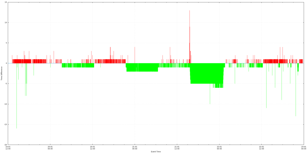
[GnuPlot] Create a plot with Date Time on X axis
Download here : [download id=”1309″]
The following script, will read the ‘data.csv’ file and create a plot with the data.
The input file (data.csv) should have two columns: the first one is a date/time string and the second is a number.
e.g
2016-01-19 13:12:38,2
2016-01-19 13:12:38,1
2016-01-19 13:12:38,0
2016-01-19 13:12:40,0
2016-01-19 13:12:41,0
2016-01-19 13:12:47,0
The chart will have on the X axis the date/time and on the Y axis the value of the second column.
All values under the 0 axis will be green and all values above it will be red.
Example output:
Execution example: gnuplot -e "filename='data.csv'; width=2000; height=1000;" timeDifference.plot
#Setting output to be a PNG file of size 'width'x'height'
#'width' and 'height' are set from the command line. e.g gnuplot -e "filename='server_1.csv'; width=10000; height=500;" timeDifference.plot
#Setting the font of all text to be 'Verdana' size 8
set terminal pngcairo size width,height enhanced font 'Verdana,8'
#Setting the output filename to be the same as the input filename with the .png extension appended to it.
set output filename.'.png'

#We set the file separator to be the comma, this way we inform the engine that we will be processing a CSV file
set datafile separator ","

#Informing the engine that the X axis of our plot will be date/time data type
set xdata time
#We define how the date/time input must be parsed. In this example we expect the input to be like '2016-01-19 14:25:00'
set timefmt '%Y-%m-%d %H:%M:%S'

#We set the output format that will be shown on the X axis. Here we expect to show '19-01 New Line 14:25"
set format x "%d-%m\n%H:%M"
#Set the X axis label
set xlabel "Event Time"
#Set the Y axis label
set ylabel "Time Difference"

#Enabling the Grid, this way major tick lines will be visible on the chart
set grid

#As we expect to have negative values as well, we make the zero Y axis line is thicker and has a different style from the rest so that it will be easier to spot
set xzeroaxis linetype 3 linewidth 1.5

#Creating a style for the lines that will be used in the plot. Type = 1, Color = green, Width = 1
set style line 1 linetype 1 linecolor rgb "green" linewidth 1.000
#Creating a style for the lines that will be used in the plot. Type = 1, Color = red, Width = 1
set style line 2 linetype 1 linecolor rgb "red" linewidth 1.000

#Actual plot command
#It directs the engine to plot the file that is in the filename variable, use the first and second column and use vertical columns with the styles we described above
#First line, We will plot only values that are greater or equal to 0, the rest we give 1/0 which is an invalid number and will not be plotted
#Second line, We will plot only values that are strictly less than 0, the rest we give 1/0 which is an invalid number and will not be plotted
plot filename using 1:($2 <= 0?$2:1/0) with impulses ls 1 notitle,\
filename using 1:($2 <= 0?1/0:$2) with impulses ls 2 notitle


