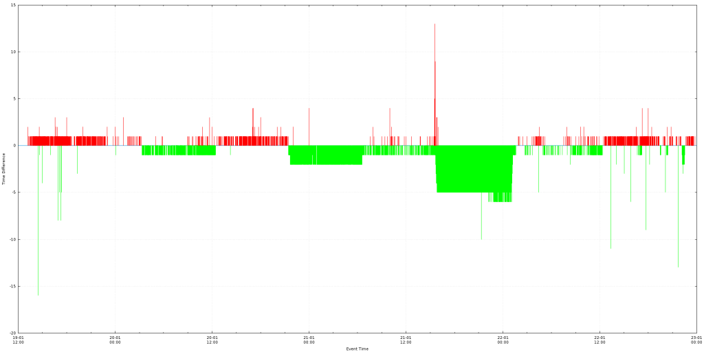
Making an animated torus in gnuplot and gimp
The gnuplot code in this article, creates several frames of a 3D torus with a visible structural grid from different viewing angles, like the one in the image below.
[download id=”3549″]
In geometry, a torus (plural tori) is a surface of revolution generated by revolving a circle in three-dimensional space about an axis coplanar with the circle. If the axis of revolution does not touch the circle, the surface has a ring shape and is called a torus of revolution.
From Wikipedia https://en.wikipedia.org/wiki/Torus
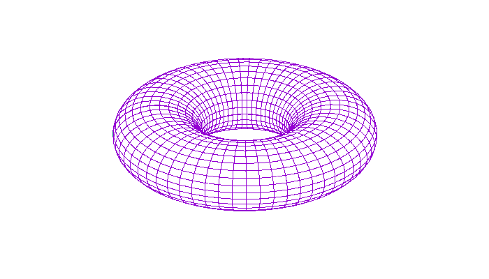
 By modifying the
 circles and rings variables in the script you can increase and decrease the number of circles and rings that appear on your torus.
The above image was generated using 60 circles and 30 rings.
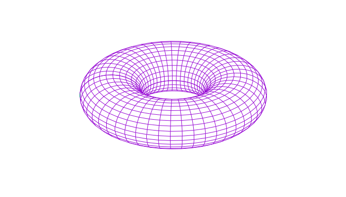
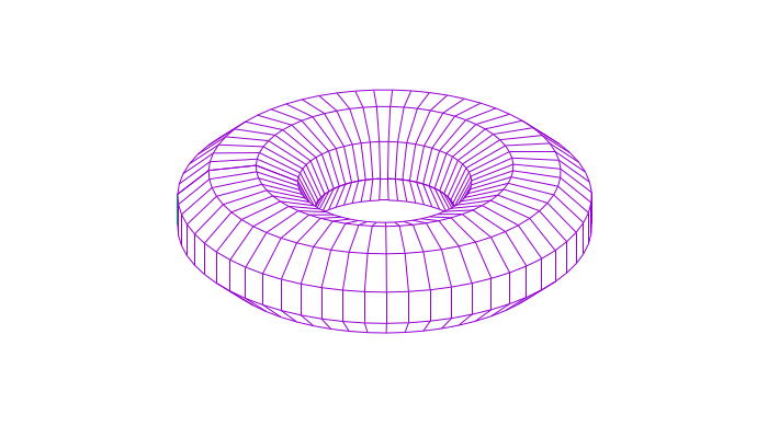
To better explain what a circle and what a ring is, please have a look at the following two examples.
The following torus has 10 circles and 30 rings.
 The next one has 60 circles and 10 rings.
 The last torus has 10 circles and 10 rings.
 Using the script, you can also play around with the
 set view command and the for loop to change the number of frames that will be produced and what movement should the camera perform before printing.
[download id=”3549″]
set terminal pngcairo transparent enhanced font "arial,10" fontscale 1.0 size 700, 400

unset key
unset border
unset tics

set dummy u, v

circles=60
rings=30

set parametric
set isosamples circles, rings
set hidden3d back offset 1 trianglepattern 3 undefined 1 altdiagonal bentover
set urange [ -pi : pi ] noreverse nowriteback
set vrange [ -pi : pi ] noreverse nowriteback

do for [i=1:360/circles] {
 set view 25, i, 1, 1
 set output sprintf('game-of-life-torus.%03.0f.png', i)
 splot cos(u)+.5*cos(u)*cos(v),sin(u)+.5*sin(u)*cos(v),.5*sin(v) with lines
}
[download id=”3549″]
Below, you can see two examples of animation we build together using the gimp application.
Showing one frame at a time.
 Accumulating all frames into one, until the loop is reset.

To create the animation we followed the next steps:
- Executed
gnuplot torus.gnuplotto generated the frames. - Then we started the
gimpand from the menuFilewe chose the optionOpen as layers...(Ctrl+Alt+o). - We selected all the images we wanted for our animation and pressed the
Openbutton. - The
Layers - Brusheswindow got populated by the new frames. Please note that window you can use that to change the order of the frames (which are now the layers). - Following, from the menu
Filewe chose the optionExport As...(Shift+Ctrl+E), from the pop-up window we selected the type of the file to begifand pressed theExportbutton. - At the final pop-up window, we enabled the
As animationcheckbox, then at theFrame disposal where unspecifieddropdown menu we choseOne frame per layer (replace)and hit theExportbutton which produce the first animation in this article (two images up).
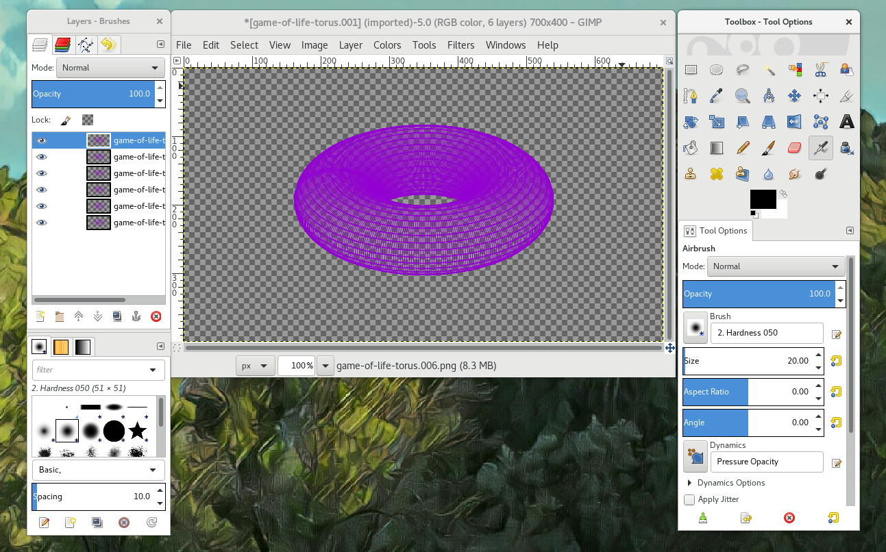
This figure shows the ‘Layers – Brushes’ window that got populated by the new frames.

From the menu File we chose the option Export As… (Shift + Ctrl + E), from the pop-up window we selected the type of the file to be ‘gif’ and pressed the Export button.
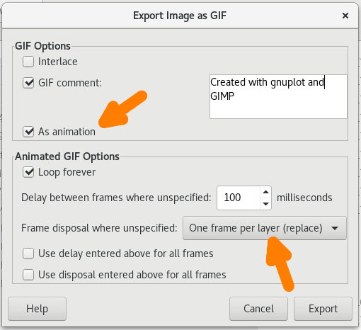
At the final pop-up window, we enabled the As animation checkbox, then at the Frame disposal where unspecified dropdown menu we chose One frame per layer (replace) and hit the Export button which produce the first animation in this article (two images up).